Alex Ripberger


BRAND

WeUp

JOURNEY

Building Better Habits With Friends


RESPONSIBILITIES

Project Management
Research
Interface Design
Interaction Design
Prototyping


SUMMARY

After years of working on a game that encourages people to achieve their goals through friendly competition, WeUp needed a fresh perspective on their mobile app.


Frame 54.png

IconSet_Uncharted_x50%.png

KICKOFF

IDENTIFYING THE CHALLENGE


THE PROJECT

Building healthy habits isn’t easy. Whether it’s getting into exercise or practicing a skill, we all struggle at one point or another with doing the things that we know are good for us. Numerous studies have been centered around methods for habit change, and there are dozens of apps on the market for helping people to make those changes.

But WeUp wanted to tackle the problem from a different angle. The small startup wanted to leverage the power of accountability, loss aversion, and gamification to empower individuals to build new habits alongside a small group of friends. 

After years at work, WeUp had reached a standstill and was coming to us for some perspective. 

 
Uncharted_AppProgression_Web.png


THE GOALS

Their designs were outdated and they needed help creating a prototype to show to investors. While they initially came to us for visual design, WeUp wanted us to take a deep dive into their app and see how we could improve it for their users. 

Our goal for this project was to explore the app design for potential improvements, and update the design for today’s phones. 


In the words of our client,“blow it up.” And dang, did we do just that.


THE AUDIENCE

Anyone who wanted to build a habit could be considered for our audience, but our client really wanted to narrow in on women between the ages of 25 and 35 in hopes of targeting an audience that frequently uses mobile apps to compete with friends. We expanded the user base to include men in that age range as well, but made the women our primary focus.

Uncharted_WomenPhoto.png

THE ROLE

As the design lead for this project, I led the team in conducting research and executing design. As I kept the project on track and aligned with business goals, I also facilitated team meetings, created personas and user stories, drafted wireframes, and led the product design, resulting in the creation of functioning prototypes.


IconSet_Discovery_x50%.png

EMPATHIZE

CONDUCTING THE RESEARCH


Discovery_UserInterviews_Web.png

USER INTERVIEWS

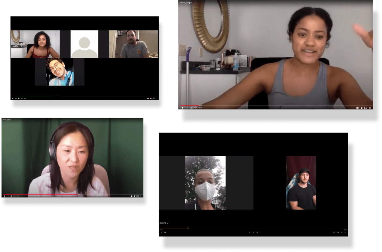
Before we jumped into solutions, we really wanted to get a clear picture of who we were designing for, so we began our research by conducting, user interviews, and a literature review regarding the behavioral research surrounding habit change.

With COV-ID 2019 in full swing, we conducted all our interviews via Zoom, which afforded us the opportunity to interview individuals from around the country. From these interviews, we compiled a vast set of data which we used to craft our personas.

Discovery_C+C Benchmarks_75%.png

SECONDARY RESEARCH

As we surveyed the landscape of habit apps in a competitive audit to find trends and identify other common features our users may expect, we found that being able to set multiple goals was a common factor we were lacking, and that video verification might be a feature worth exploring.


PRODUCT RESEARCH: Learning How To Play the Game

Now, if we were going to tackle this challenge, we needed to know the game mechanics inside and out. We requested every piece of documentation that might help us, and eventually pieced together how the app would work. Here’s a basic breakdown for you:


NOTE: These are NOT final designs; these are some of the screens from the original design


IconSet_Connection_x50%.png

DEFINE

FINDING THE PATTERNS


Connections_AffinityMap_shadow_Web.png

AFFINITY MAPPING

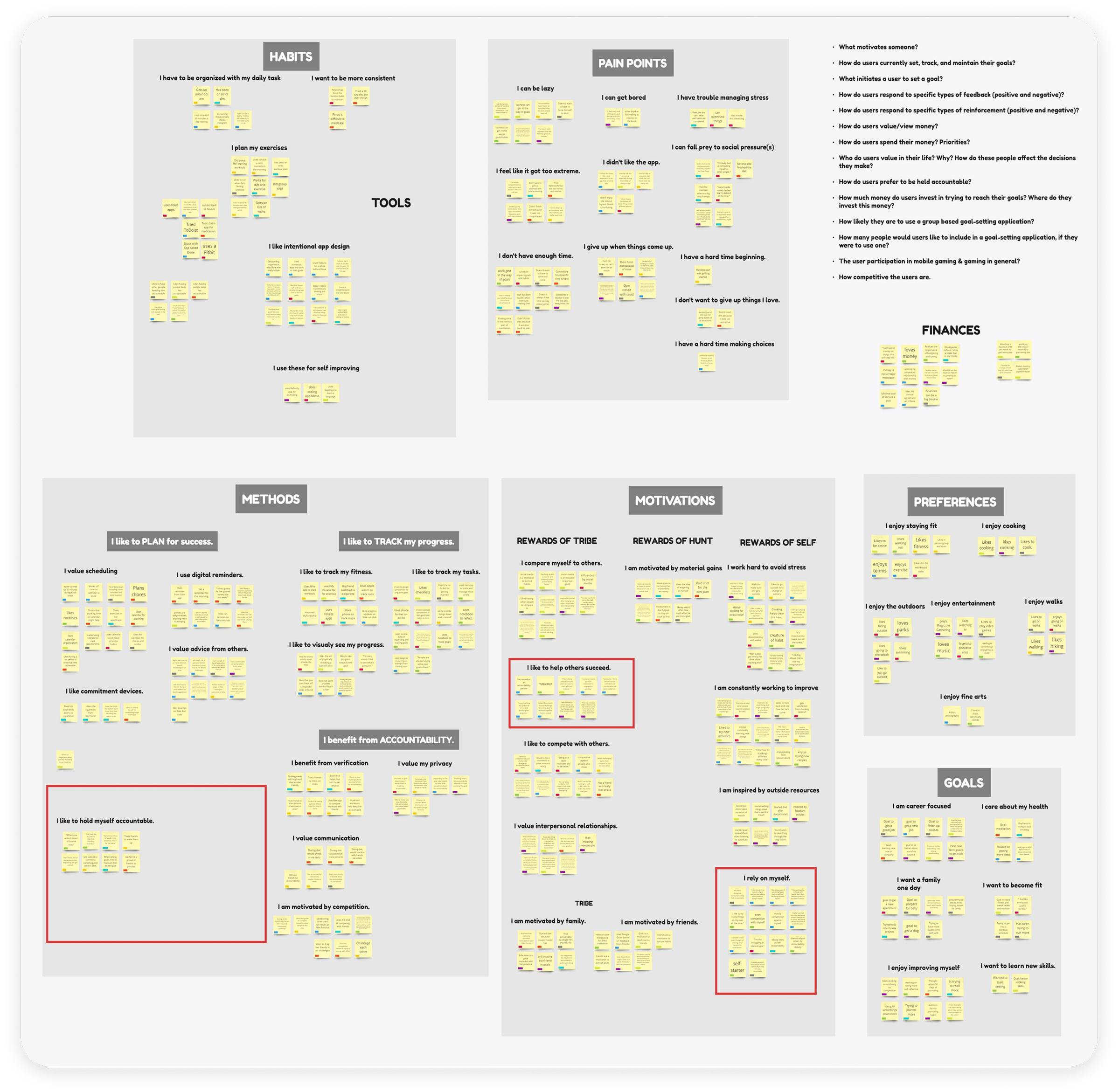
And now we get to the fun part; gathering all the data to see the world through the eyes of our users. The team gathered together in front of our glorious (and virtual) whiteboard to start organizing our data. After hours of moving that sticky-note here, and this sticky-note there, we distilled themes and I-Statements to give us some clarity on what our users challenges and motivations might be.


PERSONAS

From our research, we built two personas that would align the team on our journey: Gabby and Maya. But what we really needed was to see how they would use the app, and what pain points they might encounter on their journey. We crafted a narrative (based on other insights from our research) that wove the two of them together, and it that helped us identify three major pain points in the original game mechanics.


INSIGHTS

 
Eye.png

Reports seemed untrustworthy

Our users felt that relying on self-reporting could introduce suspicion, and using a rating system as a countermeasure might allow users to game the system in their favor, especially if money was at stake.

Sun.png

Rewards seemed too random

The sun was intended to add some variety to the game, but the randomness of its appearance and lack of connection to building habits was confusing and frustrating to many of the users we interviewed.

Accountability.png

Accountability vs Competition

This was the crux of the problem. WeUp’s Desire to build community and accountability between friends was at odds with the current game mechanics. The only way to win the game was for your friends to fail. And once real money is involved, we could be putting real friendships at risk.


IconSet_DesignExploration_x50%.png

IDEATE

DRAFTING THE DESIGNS


We were definitely doing more than just a visual update. As we said earlier, we really did need to “blow it up” a bit. But how could we piece it back together in a way that would solve those pain points, all while convincing the client that these changes were pivotal to delivering a product that was useful to the habit builders out there in the real world?


Rough sketches of the new design to explore layout, features, and flow


DesignExploration_VideoFunction_Web.png

Using video and APIs as proof of completion

Our idea to use video as a verification method came from our C+C analysis, along with integrating tools like Apple health or GPS as potential next steps. Users would record video directly to the app to prevent cheating using previously recorded uploads, and videos could be flagged for review if they seemed dubious.

DesignExploration_Rewards_web.png

Variable rewards for “streaks”

Relying on some of the work done in behavioral science, we exchanged the random rewards for variable rewards. So instead of relying on the completely random appearance of fixed rewards, we had a fixed appearance of random rewards. By giving users an opportunity to win extra points every time they achieved a five day streak, we could provide that dopamine spike that people experience in anticipation of a reward, all while tying the activity to building their habits.

Rankings2.png

Using group vs group competition to inspire accountability

Which brings us to the issue of relying on competitors to keep you accountable. This was at the heart of the game’s design, but if we wanted to encourage users to keep their friends accountable, then we need to unite them, not divide them.

And there, we had our answer. We needed to unite friends under a common goal; one that they couldn’t accomplish on their own. By doing this, they wouldn’t just have money on the table as motivation. We would leverage the social pressure to carry their own weight, as well as the opportunity to win even more money for them and their team.

By competing in tribe versus tribe competitions, users would have the potential to earn a much larger pot, as it would include the penalty money from other tribes as well as their own tribe.


RESTRUCTURING THE GAME

For these solutions to work, we had to find a way to fit them into the original business model of the app, so we gathered together and built a new game flow for the app, identifying and prioritizing key features for inclusion.


However, we weren’t the only ones with a say in the matter. If we were going to get stakeholder buy-in, we needed more than theory; we needed data. So we took it to the people and let them decide.

CONCEPT TESTING WITH USERS

We presented our two games and asked for feedback on both. Our participants overwhelmingly found the video verification to be more trustworthy than self reporting, appreciated the control over earning rewards, and felt that unity and accountability were far more present in the group vs group challenges.


SKETCHES & WIREFRAMES

With our new concept in hand, I developed rough sketches and wire frames to explore design possibilities.


Wireframes of our prototype


IconSet_CourseCorrection_x50%.png

TESTING

PROTOTYPING & USABILITY TESTS


USABILITY TESTING INSIGHTS

Putting our users at the heart of our design meant we needed to also validate that design by sharing it with customers. We conducted remote usability tests via video chat, utilizing Maze.design to facilitate the sessions and gather quantitative data from the tests. Our objectives were to see how intuitive the navigation was, and how easily people were able to understand how the game mechanics worked. All in all, our users provided us with some fantastic insights on improving the app.


Voting System Change 2.png

How could we streamline the voting system?

Our original method of voting on a challenge for the tribe felt too long to users, so we reduced it to a simple invitation to other tribe members.

Tribe Page Change 2.png

How do we help users find their Tribe?

Users weren’t always sure where to look for info about their tribe, so we decided to add “Tribes” as our new main navigation page.

Home to Challenges Change.png

How might we optimize the home page for users?

Instead of listing popular challenges on the homepage, we found that the space could serve the users better by functioning as a quick menu for all of their active challenges.

Old Check in Change.png

How could we make check-ins easier?

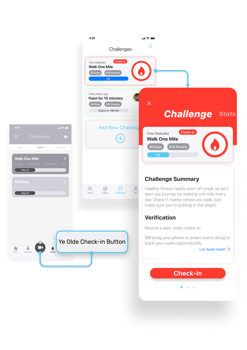
Our original strategy to make the check-in button easy to access took up too much needed space on the main navigation bar, not to mention the difficulty users had understanding how to choose which challenge they were checking-in on. Moving the check-in button to the Challenge Summary page removed the ambiguity.

Challenges Tab Change.png

How might we better organize challenge info?

In an effort to ease cognitive load on our users, we decided to use tabs to organize info from specific active challenges into chunks on the Challenge Summary page.


IconSet_Destination_x50%.png

THE RESULTS

FINAL DESIGNS


After three weeks of ups and downs and more than a few complete backtracks, we had a final prototype to present to our clients, supported by our research data.

Mockup Collage.png

 
Branding 2.png

NEW LOGO

At the beginning of the project, WeUp asked us to work on developing an updated logo and branding to accompany the app redesign. We informed them that branding would be outside the scope of our project, but that we would explore options if we had the time.

Underpromise, overdeliver.


Main Page Views for New Users


Main Page Views for Current Users


INTERACTION DESIGN

Here’s a video walkthrough of our prototype if you’re interested:


IconSet_JourneysEnd_x50%.png

TAKEAWAYS

WHAT I LEARNED


Results

When we finally presented our findings and prototype to the CEO and other key stakeholders, our designs were met with enthusiasm and excitement. We had provided them with a prototype and deliverables that would help them grow their list of investors and begin the process of turning our design into a reality.

Be like Tron…fight for the Users

Throughout the course of this project, we had to fight tooth and nail to advocate for the users, and in the end it paid off. Even when we faced resistance, we knew that we needed to follow our data to truly deliver value to our client. To get the buy-in we needed from the board, we couldn’t just show up with a new design and tell them it was better, and this project truly pushed me to walk the client through the entire journey that led us to their goal.