Alex Ripberger


BRAND

GreenBike Electric-Motion


JOURNEY

Renewing An E-Bike Website


RESPONSIBILITIES

UX Design
Visual Design
Research
Prototyping


SUMMARY

This is the story of how I took on a design challenge to breathe new life into a struggling e-commerce experience.


Portfolio_GreenBike_Header_Yellow.png
 

KICKOFF

 IDENTIFYING THE CHALLENGE


THE COMPANY

GreenBike Electric-Motion began as a small electric-bike shop in Tel Aviv in 2005, but has since expanded to Europe and the US, now based in Los Angeles. However, their website was in dire need of not only a visual update, but a complete user experience overhaul. 

Portfolio_GreenBike_OriginalMockup.png


THE CHALLENGE

As a UX designer, I took on the task of re-imagining their e-commerce site in a way that made it easier for users around the world to find an electric bike that suits their lifestyle. But as excited as I was to begin, I needed to stop and take a moment to think about my destination.

Where did I need to be at the end of this journey? 

Ultimately, the goal I was striving for was a website that made it as easy as possible for people to decide whether an electric bike was a good option for them, and which bike would fit their needs. To do that, the website needed to be visually appealing, helpful, and easy to use.


Portfolio_GreenBike_11_50%_Green Path.png
 

 DISCOVERY

CONDUCTING THE RESEARCH


And as I’m sure you can guess by now, at the beginning of the project, the website for GreenBike was neither appealing, helpful, or easy to use. 

So where do we even begin? My first steps out the door were to take a look at what we had to work with.

Spoiler alert: it wasn’t great.

 
Portfolio_GreenBike_ProblemAreas_2200.png
 

Perplexing, isn’t it? Those are the largest issues, with a dozen other smaller problems thrown in. After conducting a C&C analysis to see what other competitors were doing, it would have been easy to start creating solutions based on my own assumptions. 


But this isn’t about me; it’s about the users who would be coming to GreenBikes for a better form of transportation.


Ask the locals: Finding real people

What I really needed was to get inside the minds of people who may come across the site in search of an electric bike, but...who would that be? It’s such a niche product, and expensive at that. How could I possibly find people to interview?

Portfolio_GreenBike_15_Thank You copy.png

But let’s break down what’s really at play here. When we think about it, we don’t really need to find any bike experts or active e-bike searchers; I needed to find everyday people. The bicycles that Greenbikes builds are very affordable when compared to most e-bikes, so you would most likely have more entry-level riders browsing the site. It could be anyone, but the best candidates would be users who had bought or shopped for other expensive items online


So that’s who we interviewed. To get a better view of where the biggest pitfalls were, I needed to see what paths users took on the website. On top of user interviews, I also conducted task analysis with multiple users to see how they navigated the maze-like website.

At this point, I have the pieces of the map, but I have absolutely no idea how it all fits together.

 
Portfolio_GreenBike_5_Green Path.png
 

SYNTHESIS

FINDING KEY INSIGHTS


With data from real people in hand, the next task was to connect the dots and find actionable insights hidden beneath the surface. Using affinity mapping as my primary tool, I found four main themes to guide the design exploration:

 
Portfolio_Greenbike_StickyNotes.png


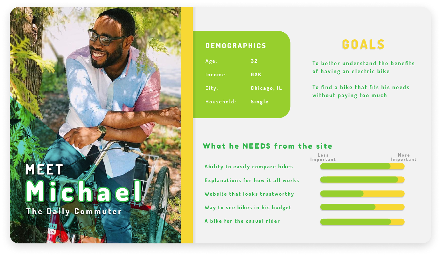
These would be the guiding stars that would lead to a better user experience for people like our persona, Michael.

 
Portfolio_GreenBike_Portfolio.png


Michael (or people like him), found similar usability issues to the one’s I had, so I knew I had to be on my guard against confirmation bias. But for now, it seemed I finally had my map to begin design explorations. Using Michael’s unfortunate journey as a guide for my steps, I could now identify where the main valleys for users were located, and needed to start coming up with ideas to help the man out.

 
Portfolio_GreenBike_8_Green Path.png
 

DESIGN EXPLORATION

 DRAFTING THE DESIGNS


If you’ve been a designer for any time at all, you know how tempting it is to just start coming up with solutions as soon as you begin. But I had carefully collected resources, and now was the time to light the forge and start building.


Navigation

The first challenge that users were up against was the ambiguous site navigation, so I conducted a card sort to re-organize the site into a more fluid and intuitive layout.


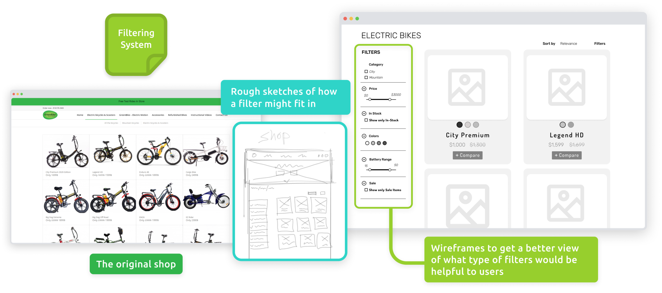
Filters

But let’s say they understand how it all works and are ready to find a bike; how do they find a bike that works for them? There are so many to choose from, and nothing to distinguish one from another?

We needed to add a way to filter by bike features to guide them toward their goal.

 
Portfolio_GreenBike_Mid-FiGroup_Filtering.png


Educate

However, even if users could navigate easily through the site, they still faced the challenge every novice encounters: knowing what to look for.

With electric bikes being a new technology, people need to be able to understand how electric bikes work, and will look to the website for explanations. If users have to go to another competitor to figure out what factors might affect t he battery life of your bike, then you’ve already lost the customer.

Piecing together insights from other e-bikes stores, I added in articles and photographs to help users understand how electric bikes worked, growing their trust in the expertise of the company.


Compare

With expensive products, all of the users I interviewed said that they needed to compare different products, so creating a tool that allowed people to easily compare between different models was extremely important.


Armed with these wireframes, I needed to see if it would hold up to the real test: actual people.

 
Portfolio_GreenBike_7_Green Path.png

TESTING

 PROTOTYPING & USABILITY TESTING


Imagine trying to cross one of those rickety rope bridges that span a deep chasm; you really want to make sure things are nice and secure before waltzing across. In the same manner, I built a rough prototype to test my designs concepts with real individuals before investing time and effort into a flawed solution (in keeping with the previous metaphor, I needed to stomp on some planks to see if my foot would bust through before I accidentally sent Michael to his doom).

Mercifully, the design concepts held up to the weight of usability testing, and I was able to confidently move forward in polishing the tools and the overall aesthetic of the site.

Growth Point: I didn’t have the knowledge about electric bikes to create content that would be helpful in teaching the users about the technology used in GreenBike products, so I couldn’t test for efficacy. One thing I took away from these tests was…

Growth Point: I didn’t have the knowledge about electric bikes to create content that would be helpful in teaching the users about the technology used in GreenBike products, so I couldn’t test for efficacy. One thing I took away from these tests was really striving to come up with more rigorous tasks, in order to test the tensile strength of the prototype a bit more.


As is often the case, the final challenge that blocked me from my destination was a beast; I needed to update the look and feel of the website to match what I had come to understand about Greenbike’s users. It needed to feel approachable and friendly, while also exciting people about owning such an innovative product!

Portfolio_Greenbike_StyleGuide@05x.png
 

Using bright colors and rounded, easy-going typography, I brought a new vitality to the sight that would attract users and effortlessly draw their attention down the page, inviting them in with each visual element.  

City Bikes.png
Mountain Bikes.png
Portfolio_GreenBike_8_Green Path.png
 

THE RESULTS

 FINAL DESIGNS


Portfolio_Greenbike_Mockup_Main@05x.png
 
Portfolio_Greenbike_ProductPage_Breakdown.png
 
 
Portfolio_Greenbike_Hifi_Homepage.jpg
Portfolio_Greenbike_Hifi_Shop_half.png
Portfolio_Greenbike_ProductPage_half.png
 
 
Portfolio_GreenBike_6_Green Path.png

TAKEAWAYS

 WHAT I LEARNED


But a journey is never really over. We build new skills, gain a few scars, set new goals, and learn from our mistakes.

You may have noticed that this project was desktop specific, which was due to the parameters of the design challenge. Going from desktop to mobile is always tricky, but that would be the first improvement I would make.

One feature that could have been of great use to shoppers was a guided quiz to help people find a bike that fit their intended usage. Due to time constraints, I wasn’t able to fully build it out, but I think it would really help to build trust with potential customers.

Learning how to find my target audience for interviews stumped me at the beginning. It wasn’t until I challenged myself to really dig deep and think about who Greenbikes customers were that I realized it wasn’t important to find “individuals who have purchased an electric bike online”, but rather individuals who had never purchased an electric bike before, and who would have lots of questions. 

Another takeaway from this project was trying to make fewer assumptions on the front end and really allowing users to guide my thinking. Bias can always creep it’s way into a project, especially as a solo UX researcher/designer, so I always need to be wary when I end up confirming my own beliefs.

In the end, Greenbike was an adventure, and I’ll be using the tools I gained along the way for years to come.